Case Study · Nonprofit · SEO, AEO & Content Strategy
Rebuilding a Church Partnership Page with AI-Assisted Content Analysis
How I audited a national disaster-relief charity’s church partnership landing page with Claude, added human strategy on top, and turned the findings into a build-ready wireframe that designers and developers could execute section by section.
The challenge
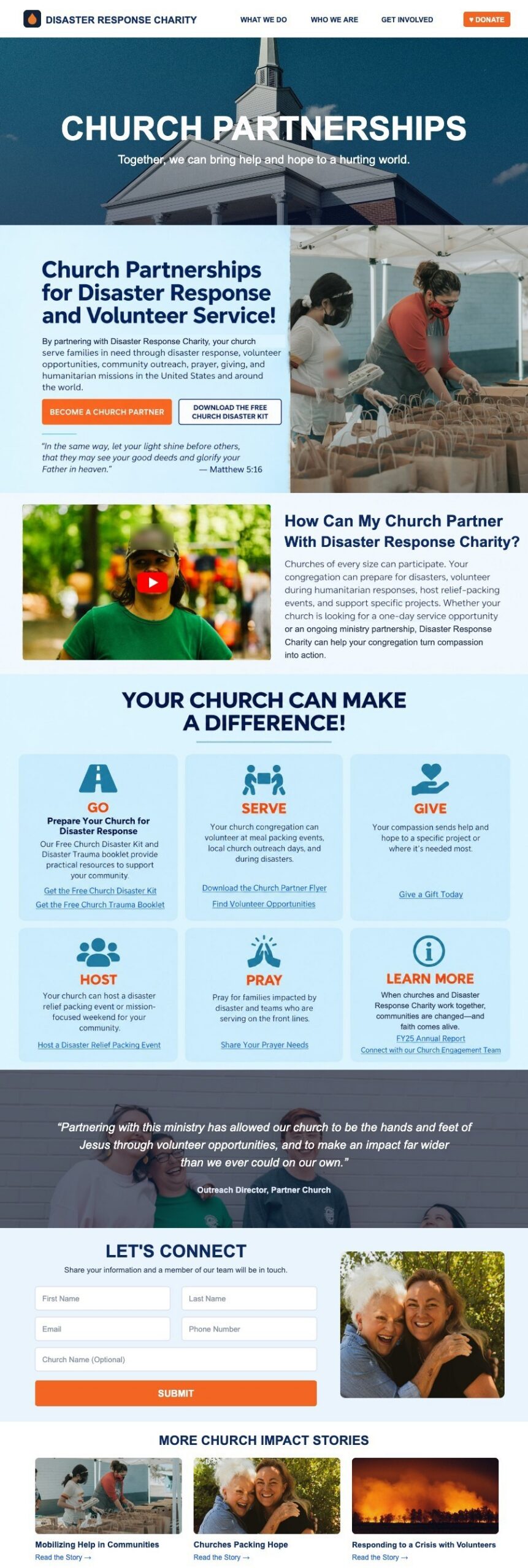
The church partnership page had good bones: strong photography, a video, a sign-up form and six ways to get involved. But it was written for people who already knew the program. The page title and description didn’t name the thing churches actually search for (disaster response). The opening asked visitors to feel inspired before telling them what partnership means. Calls to action were buried, and the “Stories of Church Impact” were a plain list of links that few people would click.
The goal for phase one: make simple, high-impact improvements to the existing page, with no rebuild, and lay out a roadmap for growing it into a full church resource section.
My process: AI analysis plus human judgment
I used Claude to work through the page section by section: summarizing what each block communicated, flagging where the copy didn’t match how churches search, and drafting alternative headlines and descriptions. AI made the audit fast and thorough. The judgment calls stayed human: what fits the ministry’s voice, which changes the design team could realistically ship in phase one, and which ideas belonged in a later phase.
What I recommended
| Element | Before | After |
|---|---|---|
| Page title | Church Partnership | Church Partnership & Disaster Response |
| Meta description | Your church can partner with Disaster Response Charity to meet urgent needs and share God’s love in times of crisis… | Explore a church partnership program with Disaster Response Charity and help provide your community with disaster response, hunger relief, and hope. |
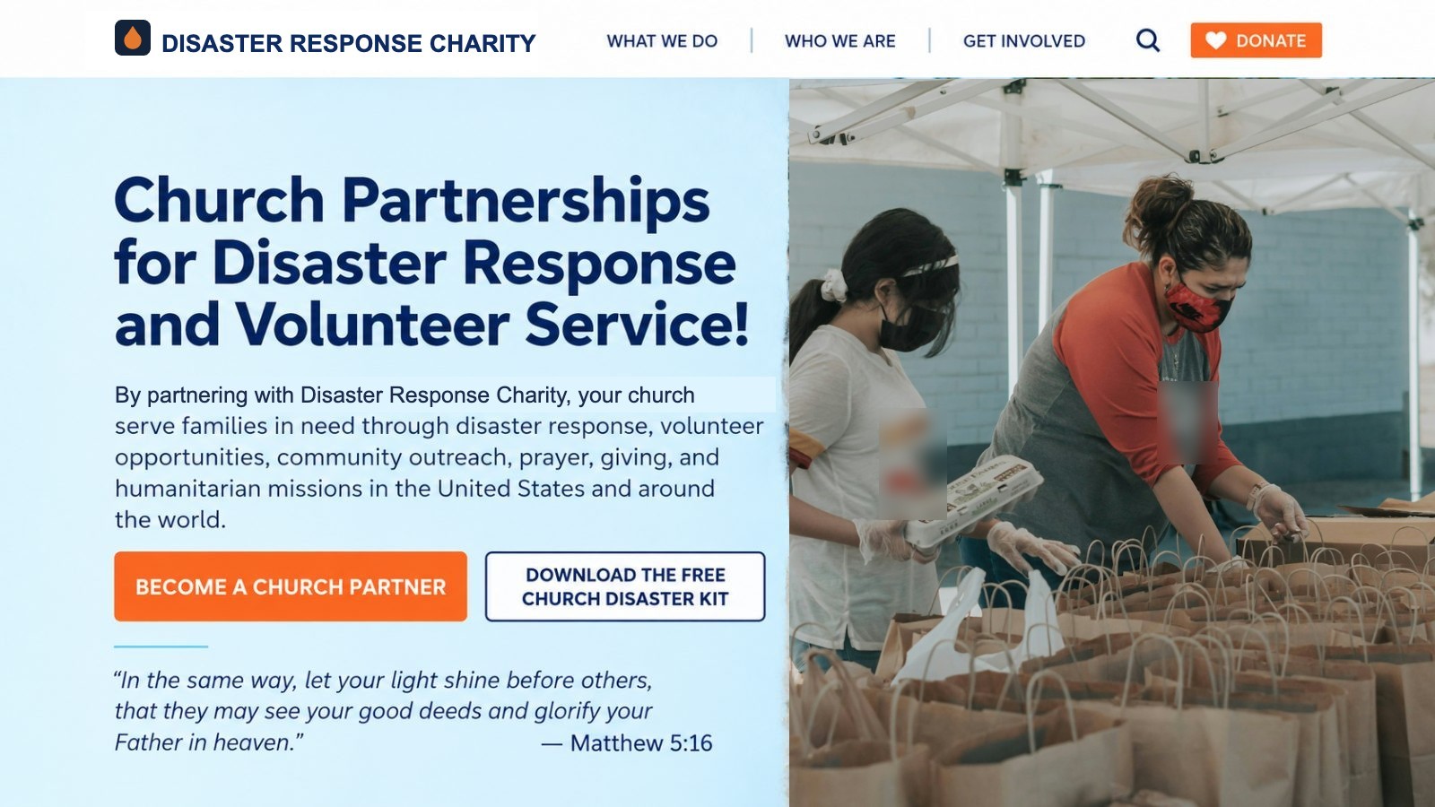
| Opening headline | As the local church, YOU are God’s chosen vessel to reach the world! | Church Partnerships for Disaster Response and Volunteer Service! |
| Calls to action | None above the fold | Two buttons: “Become a Church Partner” and “Download the Free Church Disaster Kit” |
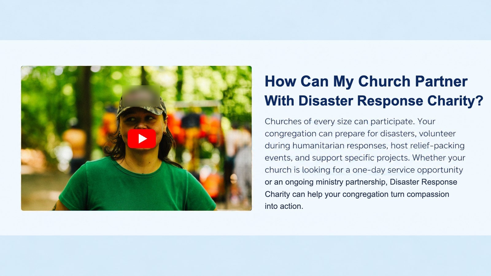
| Video block | Full-width video with no context | Split layout: video beside a new “How Can My Church Partner With Disaster Response Charity?” answer |
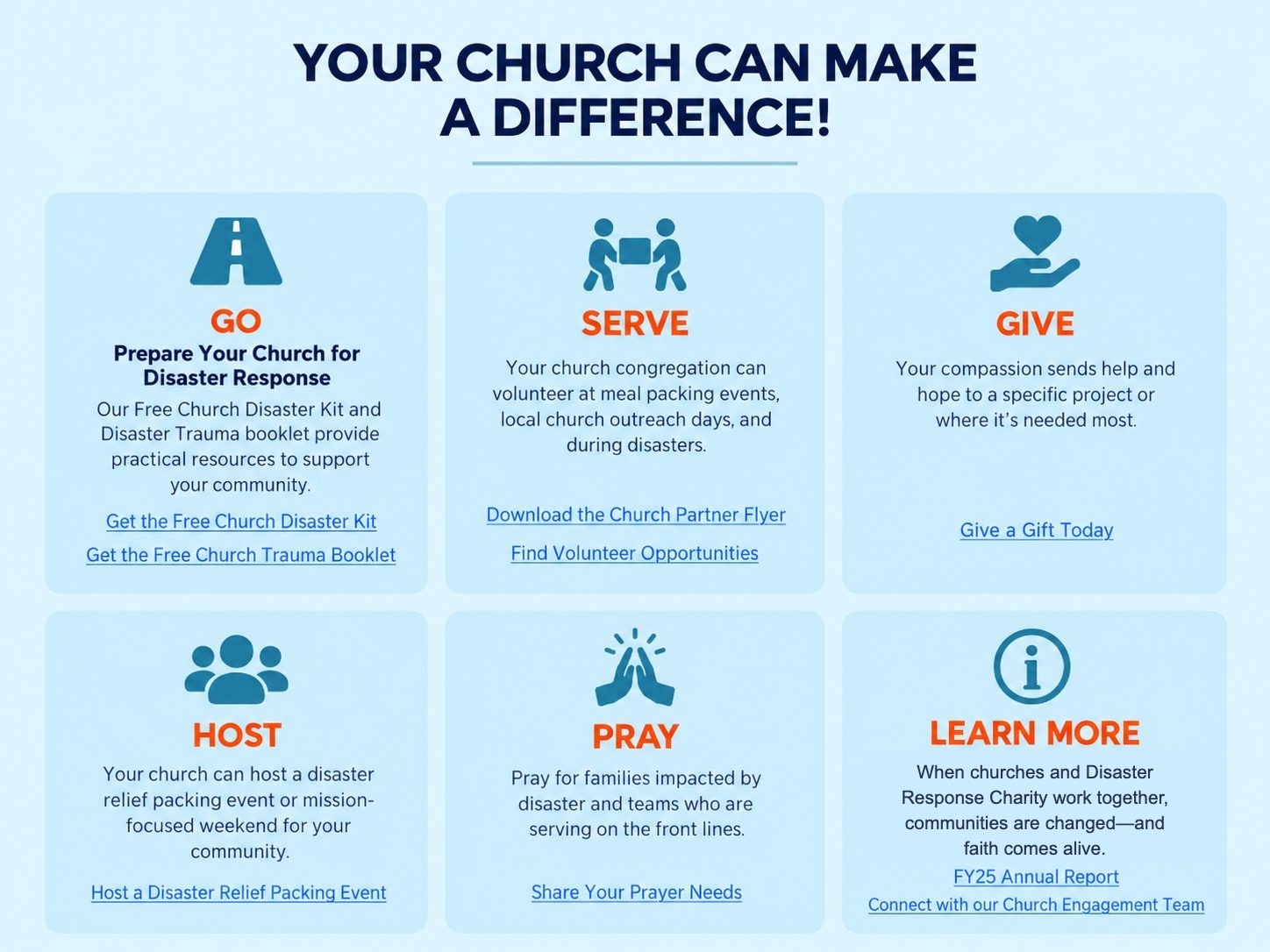
| Six action tiles | Short labels and vague links (“Church Disaster Kit”) | Benefit-led headings and action links (“Get the Free Church Disaster Kit,” “Host a Disaster Relief Packing Event”) |
| Impact stories | Plain bulleted list of seven links | Photo story cards in a slider, plus a “More Church Impact Stories” grid |
The redesigned sections
Why these changes work
Search intent
“Disaster response” is what churches look for when they want to help. Putting it in the title, description and headline matches the page to real searches.
AI answer engines (AEO)
A question-style heading with a direct, complete answer (“How can my church partner…?”) is the format ChatGPT, Perplexity and Google AI Overviews tend to quote.
Conversion
Two clear buttons at the top give ready visitors an immediate next step and offer a free resource to those still deciding.
Engagement
Visual story cards turn a list nobody clicks into proof that partnership works, which is exactly what a pastor needs before committing.
Phase two roadmap
Beyond the quick wins, I mapped how the page can grow into a full church resource hub:
- A dedicated /church/ subdirectory to organize church content under one strong URL path
- Landing pages with sign-up benefits for the Church Disaster Kit and Disaster Trauma Booklet
- Church event articles and program pages brought under the new structure
- A Free Church Resources hub with scripture pages, devotionals and downloadable materials
The deliverable
Results
Phase-one updates are being implemented now. I’ll add measured results here, such as organic traffic, Church Disaster Kit sign-ups and partner inquiries, once the new page has been live long enough to show a trend.
Skills demonstrated
Want this kind of audit for your site or team? I combine AI speed with hands-on marketing judgment to find what’s holding a page back, then hand over a plan your team can build.
Email MichaelThese are mock-ups to protect privacy. The organization appears under a fictional name, Disaster Response Charity, and photos of people are free-license stock images standing in for the real page photos. The audit, recommendations and page structure are shown as delivered. Stock photos by Skyler Smith, Brooke Balentine, Logan Weaver, Ismael Paramo, Fachy Marín and Maria Oswalt on Unsplash.